Case Study
Logitech Arx Control
Overview
Problem
Logitech Arx Control is a companion application for Logitech Gaming Software or GHUB which has an old-fashioned user interface and terrible information hierarchy. Even though this application has a great potential to be used by Logitech users because there are a lot of users can do in this application for example change device settings and watch device statistics, the latest update of Logitech Arx Control is in March 2016.
Solution
Logitech Arx Control is a companion application for Logitech Gaming Software or GHUB which has an old-fashioned user interface and terrible information hierarchy. Even though this application has a great potential to be used by Logitech users because there are a lot of users can do in this application for example change device settings and watch device statistics, the latest update of Logitech Arx Control is in March 2016.
Duration
3 Weeks
Project Type
Design Explore
Role
UX Research – UI Designer
Timeline
Google Play Review
I pick some reviews on Google Play in range 1 - 3 star to know deeply about what user’s pain.
Analizing
Based on the Google Play reviews, I summarize it to pain points and create room for improvements.
Redesign
Here I make the design based on room for improvements point that I made in previous phase of design thinking.
A/B Testing
Last phase, I test my design using A/B testing method to 7 - 8 people.
Research
User Needs
As a UX designer, I shouldn’t make a design by personal assumptions, that way I find the suitable method to dig deeper into what the user genuinely needs to solve the problem. So I decided to watch some reviews on Google Play Store to find out what pain users feel when using Logitech Arx Control, and what they want about it.
Google Play Store Reviews
From other methods for digging information about user needs, I choose the simplified diary study instead of using the daily experiences, I took their review based on their own experience. This way, I still can get what users need from reviews.
Pain Points
After looking at a bunch of reviews about Logitech Arx Control, I conclude some points that reflect their pain when using Logitech Arx Control.
- Incomplete feature
- Technical label writing
- Boring visual
- Overwhelmed element size
Design
Side to Side Comparison
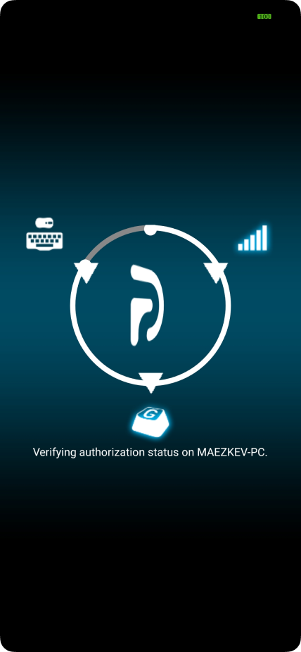
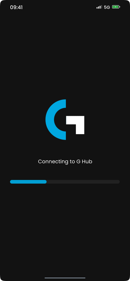
Connect
Show connection progress at first launch
Improvements:
- Change process visual to be clearer and progressive
- Show status on every ongoing process
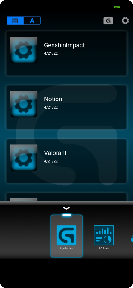
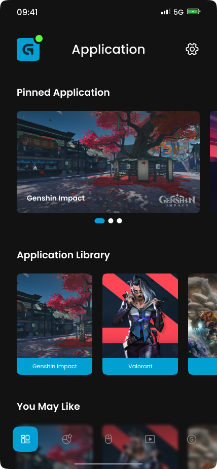
My Application
Show customized application button
Improvements:
- Change menu name from “My Games” to “My Application”
- Change page layout into sections
- Add a thumbnail for each application
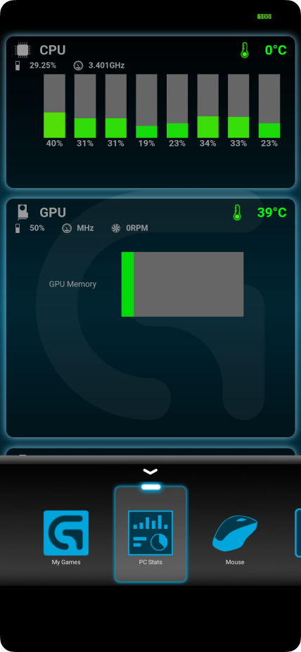
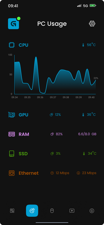
PC Stats
Show PC component usage
Improvements:
- Add missing PC component
- Change the graph bar into a line graph (Show average usage of all core for CPU)
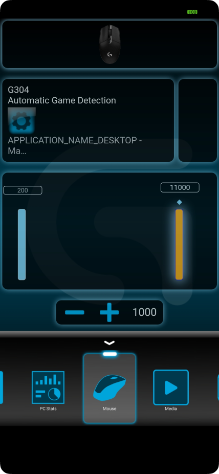
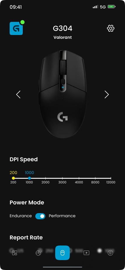
Devices
Change device setting
Improvements:
- Change menu name from “Mouse” to “Device”
- Change page layout to fix user reading hierarchy
- Add missing feature
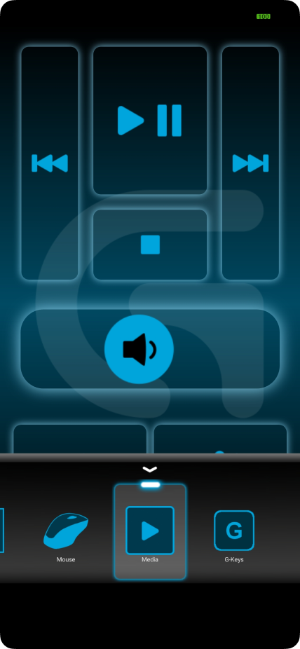
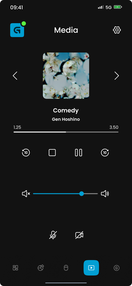
Media
Control media input and output
Improvements:
- Change the layout to be clearer and intuitive
- Add active played media
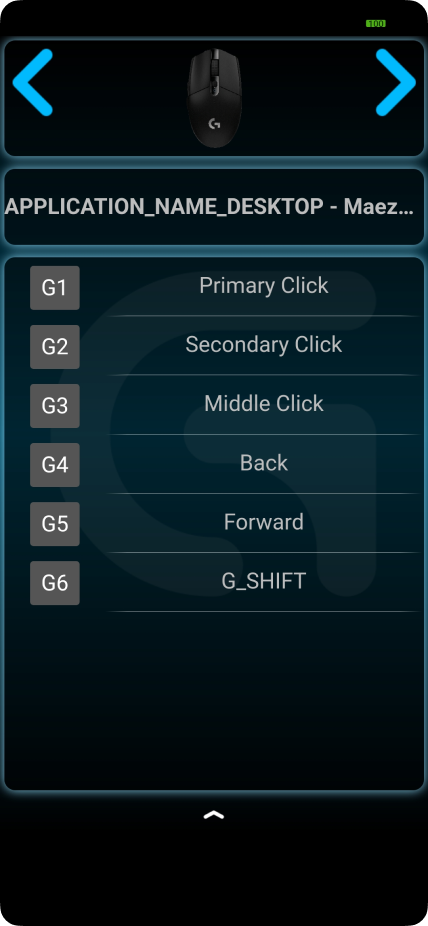
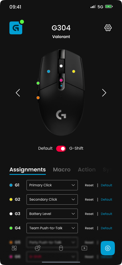
G-Keys
Change device spesific key
Improvements:
- Increase devise model size
- Add a sign for every key that can be customized
- Add advance key setting (Macro, action, etc)
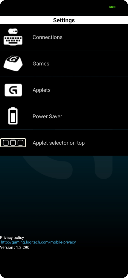
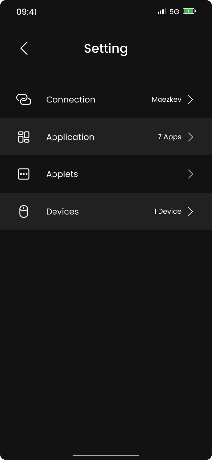
Setting
Setting up Logitech Arx Control
Improvements:
- Change the visual to be more minimalist and match the whole redesign.
Prototype
To accommodate the testing phase, I create the application prototype based on the current Hi-Fi design. This way, I can conduct usability testing to understand whether the application is intuitive or not. Also using the prototype, the application will look very real, so the user can easily imagine how the product will become.
Thank you so much for reading through my case study! Hope you enjoyed and can understand my design and design process. ✨